SQL-Engineering-Handbook
06 · Executive Dashboards
🏠 Module Home · 🗂️ Handbook Home · ← 05 Business KPI Reports · Next → 07 Real-World Analytics Project ▶
Module: 02 — Advanced Aggregations Domain used in this file: Healthcare (
patients,visits,departments,providers) Companion file:06_EXECUTIVE_DASHBOARDS.sql
Introduction
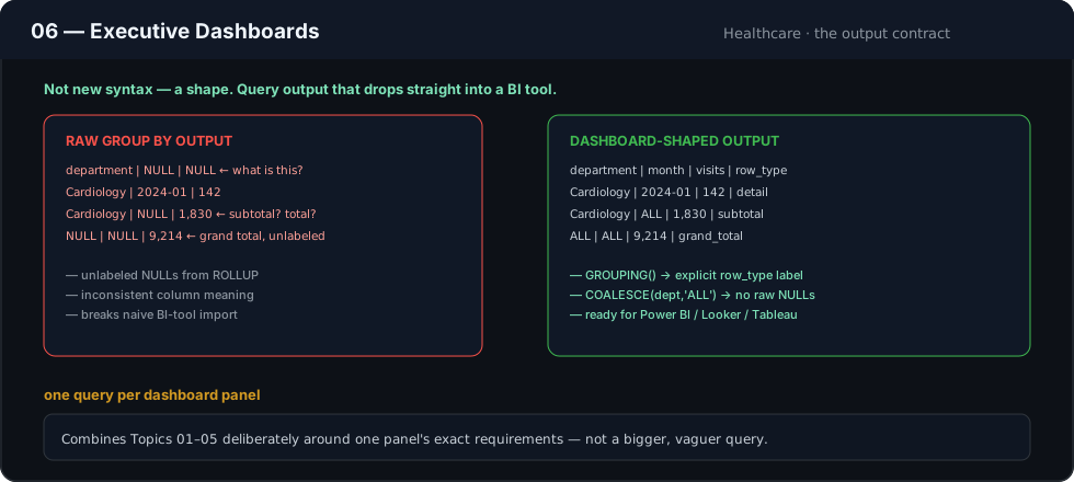
An executive dashboard is not just a KPI report (Topic 05) — it’s a KPI report designed to be consumed directly by a BI tool or presentation layer, with a specific shape: predictable columns, no raw NULLs that need explaining, subtotal/grand-total rows properly labeled, and every metric traceable back to a defined business question. This topic is about designing the output contract, not new aggregation syntax.
Concept Overview
Where Topics 01–05 focus on computing the right numbers, this topic focuses on shaping the result set so it can be dropped directly into Power BI, Looker, Tableau, or a scheduled export without further transformation. This means combining multi-column grouping, conditional aggregation, and ROLLUP/GROUPING SETS from earlier topics, deliberately, around a single dashboard’s exact requirements — one query per dashboard panel, each producing a clean, presentation-ready table.
Business Motivation
A hospital operations director opens a dashboard each morning expecting: patient visit volume by department, average wait time, and a same-day-vs-scheduled breakdown — with department subtotals and a hospital-wide total, formatted so the BI tool doesn’t need to do any additional math or label-cleanup. The SQL behind that panel has to be exactly right the first time, because a director glancing at a dashboard will not debug a mislabeled NULL subtotal row — they’ll just distrust the dashboard.
Why This Feature Exists
BI tools are good at rendering data, not at correctly re-deriving business logic. Pushing every conditional definition, subtotal, and ratio calculation into SQL — rather than leaving it to be reconstructed in the BI tool’s own formula layer — keeps the definition in one place, version-controlled, and consistent regardless of which tool eventually renders it (a dashboard today, a scheduled CSV export tomorrow).
Real Company Examples
- Hospital systems — daily census and visit-volume dashboards by department, refreshed each morning for operations leadership.
- Retail chains — daily sales dashboards by store and category, refreshed hourly during business hours.
- Airlines — on-time performance dashboards by route and carrier, refreshed several times per day for operations control centers.
Business Problems Solved
- Morning operations dashboards requiring clean, pre-labeled subtotal rows
- Multi-panel executive dashboards where each panel is backed by exactly one well-defined query
- Scheduled exports (PDF/Excel/email) that must render correctly with no manual cleanup
- Any dashboard where a raw, unexplained
NULLwould be read as missing data rather than a subtotal
Visual Explanation
┌───────────────────────────────────────────────────────────────┐
│  DASHBOARD PANEL: Daily Visit Volume by Department              │
│                                                                   │
│  Department      Visits    Avg Wait (min)    Same-Day %          │
│  ─────────────────────────────────────────────────────────      │
│  Cardiology       142        18.4               22.5%            │
│  Emergency        310        41.2               88.1%            │
│  Pediatrics        96        12.7               15.6%            │
│  ─────────────────────────────────────────────────────────      │
│  All Departments  548        27.9               45.2%            │
└───────────────────────────────────────────────────────────────┘
      ▲
      One query, ROLLUP-based, feeding this panel directly --
      no post-processing in the BI tool required.
Syntax
Executive dashboard queries compose everything from Topics 01–05:
SELECT
    COALESCE(dept.department_name, 'All Departments')                 AS department,
    COUNT(v.visit_id)                                                  AS total_visits,
    ROUND(AVG(v.wait_time_minutes), 1)                                 AS avg_wait_minutes,
    ROUND(100.0 * COUNT(CASE WHEN v.visit_type = 'SAME_DAY' THEN 1 END)
          / NULLIF(COUNT(v.visit_id), 0), 1)                            AS same_day_pct
FROM visits      AS v
JOIN departments AS dept ON v.department_id = dept.department_id
GROUP BY ROLLUP(dept.department_name)
ORDER BY GROUPING(dept.department_name), department;
Detailed Walkthrough
SELECT
    COALESCE(dept.department_name, 'All Departments')                  AS department,
    COUNT(v.visit_id)                                                   AS total_visits,
    ROUND(AVG(v.wait_time_minutes), 1)                                  AS avg_wait_minutes,
    ROUND(100.0 * COUNT(CASE WHEN v.visit_type = 'SAME_DAY' THEN 1 END)
          / NULLIF(COUNT(v.visit_id), 0), 1)                             AS same_day_pct,
    GROUPING(dept.department_name)                                       AS is_hospital_total
FROM visits      AS v
JOIN departments AS dept ON v.department_id = dept.department_id
WHERE v.visit_date = CURRENT_DATE
GROUP BY ROLLUP(dept.department_name)
ORDER BY is_hospital_total, department;
WHERE v.visit_date = CURRENT_DATEscopes the panel to “today,” matching what a live operations dashboard needs — filtering happens before aggregation, keeping the query efficient.ROLLUP(department_name)produces per-department rows plus one hospital-wide total row, in one pass.COALESCEconverts theROLLUP-generatedNULLinto the label'All Departments'directly in the query — the BI tool receives a clean, already-labeled string, not aNULLit has to special-case.same_day_pctis a conditional-aggregation ratio (Topics 03 and 05 composed together), computed once per row including the rollup total.is_hospital_totalis exposed as its own column so the BI tool can, if needed, visually distinguish the total row (bold, separated) without re-deriving which row is the total.
Production Workflow
Dashboard-panel queries are typically one-to-one with a BI tool’s visual: one query per chart or table on the dashboard, each independently scheduled to refresh at whatever cadence that panel needs (real-time, hourly, daily). Query results are frequently materialized into narrow, purpose-built summary tables so the BI tool never has to run the full aggregation live against raw transactional data on every page load.
Analytics Engineering Perspective
- Design for the dashboard consumer, not for SQL elegance. A slightly more verbose query that hands the BI layer clean, pre-labeled, ready-to-render data is better engineering than a terser query that pushes cleanup work downstream.
- One panel, one query, one owner. Keeping dashboard queries scoped to exactly one panel (rather than one giant multi-purpose query) makes each panel independently testable, debuggable, and schedulable.
- Version and test dashboard queries like application code. A dashboard a hospital director checks every morning deserves the same code-review rigor as production application code — a silent definitional change should never ship without review.
Performance Considerations
- Dashboards refreshed frequently (hourly or real-time) should query a pre-aggregated summary table, not raw transactional tables, to keep load times acceptable under concurrent dashboard viewers.
WHEREfilters that scope a dashboard to “today” or “this week” should hit an indexed date column — an unindexed date filter is one of the most common causes of a slow-loading dashboard.- Keep each panel’s query as narrow as possible (only the joins and columns that panel actually needs) rather than reusing one wide, multi-purpose query across several panels.
Edge Cases
- Empty department on a slow day. A department with zero visits today will not appear in the
ROLLUPoutput at all — if the dashboard needs to show0explicitly for every department (rather than omitting quiet departments), an outer join against a full department list is required, as noted in Topic 01’s Edge Cases. - Real-time dashboards and in-progress days. A “today” panel viewed at 9 AM will show a fraction of the day’s eventual volume — clearly label the refresh timestamp so viewers don’t misread a low mid-morning number as a problem.
- Timezone alignment between the database and the hospital’s local operating day matters for any
CURRENT_DATE-scoped panel — confirm the session or column timezone matches the operational definition of “today.”
Common Mistakes
- Sending a BI tool raw
NULLsubtotal rows fromROLLUP/CUBEwithoutCOALESCE, forcing the dashboard designer to special-case it in the visualization layer. - Building one oversized, multi-purpose query for several dashboard panels instead of one focused query per panel — harder to test, debug, and independently reschedule.
- Omitting a timestamp or “as of” label on a real-time panel, leading viewers to misinterpret a partial day’s data as a complete trend.
- Leaving quiet/zero-activity groups (like an empty department) missing entirely instead of explicitly showing zero, when the dashboard’s design calls for a complete, always-present list.
Best Practices
- Always
COALESCEROLLUP/CUBE-generatedNULLs into a readable label before handing results to a BI tool. - Scope each query to exactly one dashboard panel’s requirements.
- Include a
GROUPING()-derived flag column for any subtotal/total row so the presentation layer can style it without extra logic. - Timestamp or clearly flag any panel showing partial/in-progress period data.
- Materialize frequently-refreshed dashboard queries into summary tables rather than aggregating raw data on every page load.
Interview Questions
- What’s the practical difference between a “KPI report” query and an “executive dashboard” query?
Largely the same aggregation techniques, but a dashboard query is additionally shaped for direct BI-tool consumption — clean labels, no raw
NULLs, one query per panel, often filtered to a live time window. - Why is
COALESCE-ingROLLUPoutput important for a dashboard specifically? BI tools render whatever the query returns; an unexplainedNULLin a dashboard table looks like missing or broken data to a business user, not a subtotal. - Why favor one query per dashboard panel over one large multi-purpose query? Independent testability, independent refresh scheduling, and easier debugging when one panel needs to change without affecting others.
- What’s a risk of a real-time “today” dashboard panel viewed early in the day? It reflects only a partial day’s activity and can be misread as unusually low performance if not clearly labeled as in-progress.
- Why should dashboard queries be code-reviewed with the same rigor as application code? Executives and operational leaders act on dashboard numbers directly; a silent definitional error can lead to a real, uncaught business decision made on wrong data.
Summary
Executive dashboard queries are the culmination of everything in this module, deliberately shaped around one specific panel’s needs: clean labels via COALESCE, subtotal/total awareness via GROUPING(), conditional business metrics via CASE, and a scope tight enough (WHERE, indexing) to load quickly for a live audience. The aggregation techniques are unchanged from earlier topics — the discipline is in designing the output contract for the people who will actually look at it every day.
Practice Challenges
- Extend the walkthrough query to add a
provider_countcolumn: how many distinct providers saw patients in each department today. - Modify the walkthrough to show zero-visit departments explicitly, using an outer join against a full department list.
- Add a
report_generated_atcolumn (current timestamp) to the walkthrough output, and explain why a dashboard panel should include it. - Design a two-panel dashboard: one query for “today’s visit volume by department” and a second, separate query for “this week’s average wait time trend by day” — and explain why these should remain two separate queries rather than one combined one.
- Rewrite the walkthrough query to scope to “this week” instead of “today,” and discuss what additional label or context the dashboard should show to make that scope obvious to a viewer.
Further Reading
- PostgreSQL Documentation — Date/Time Types and CURRENT_DATE
- MySQL 8.0 Reference Manual — Date and Time Functions
- Microsoft Learn — Designing Reports for Power BI (Best Practices)
◀ Previous: 05_BUSINESS_KPI_REPORTS.md · Next ▶ 07_REAL_WORLD_ANALYTICS_PROJECT.md